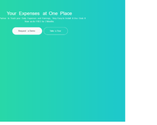
This is a template of a web form with an animated bootstrap product banner, designed using HTML, CSS, and bootstrap 4 framework. The images and fonts are imported to the form with their URLs. The form is given a style set of font-family as "Montserrat", sans-serif, color as #8d97ad, font-weight as 300, padding-top as 80px, and opacity as 0.8. The header text is given the styles line-height as 40px, and font-size as 36px, whereas the image is given a margin-top and bottom values of 80px and -100px respectively. The background of the form is set to a linear gradient color of #2cdd9b. The "Take a tour" button has the background color as same as the color of the form, which takes the color #ffffff in a hover effect while the "Request a demo" button is given a background and a border color of #263238, which takes the background color #ffffff in a hover effect.

This is an example of a web form with a set icons with a page turn effect on hover, designed using CSS, HTML, and JavaScript. The fonts and icons are imported to the form with their URLs. JavaScript functions have been used to implement the mouse hover effects. The icons are given the styles of box-sizing: border-box, perspective: 50em, transition: all 0.4s ease, background-color: #7e1946, border-radius: 5px, border: 1px solid rgba(255, 255, 255, 0.1), box-sizing: 0 0 5px rgba(0, 0, 0, 0.5), color: #e6e6e6, display: inline-block, font-size: 40px,height: 75px, line-height: 75px, margin: 40px, position: relative, text-align: center, and width: 75px. The icons are given a border radius of 5px 0 0 5px. The icons are primarily given two background colors; #69153a and #7e1946 which change into #1d5599 and #2468bb, in a hover event with a transform style of transform: rotateY(180deg).

This is another example of a card layout with images that have a slide down icon appearing on them as a hover effect, designed using CSS, HTML, and JavaScript. The fonts and images are imported to the form with their URLs. JavaScript functions have been used to implement the mouse hover effects. The image card is given the styles of position as relative, display as inline-block, overflow as hidden, margin as 10px,min-width as 230px, max-width as 315px, width as 100%, color as #ffffff, font-size as 16px, and transform as translateZ(0). %. The image has the styles of vertical-align as top, max-width as 100%, and backface-visibility as hidden. In a hover event, a card with the icon and background color of #009ab6, opacity of 1, appears in front of the image card with a transforming effect of translateX(0).

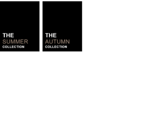
This is another example for a card layout with an image, and a title with a hover effect, designed using CSS, HTML, and JavaScript. The fonts and images are imported to the form with their URLs. JavaScript functions have been used to implement the mouse hover effects. The image card is given they styles of font-family as 'Poppins: 400,700', Arial, sans-serif, position as relative, display as inline-block, margin as 10px, min-width as 250px, max-width as 310px, width as 100%, background-color as #000000, color as #ffffff, text-align as left, font-size as 16px, and box-shadow: 0 0 5px rgba(0, 0, 0, 0.15). The image has the styles of vertical-align as top and max-width: 100%. The header inside the image has the styles of font-size as 44px, font-weight as 400, line-height as 1, letter-spacing as 1px, text-transform as uppercase, and margin: 3px 0. The title 1 is given a font weight of 700, title 2 is given a font weight of 300 and a color of #a58e7c, and title 3 is given a font weight of 700 and a font size of 25px. The image takes a transformation of scale(1.3) rotate(5deg), in a hover effect.
Source: https://littlesnippets.net/snip1581

This is an interesting snippet with less animation and more of effect. This looks like a swing moving front and back. Each letter is placed in a span where the animation will last for 2 seconds, works alternately and infinite. Alternate letters are set with a delay of 0.5 seconds. A keyframe is used to set the fonts while the animation is complete. Media screen property helps to set the fontzise in smaller devices allowing to view the animation and effect in all types of devices. With this animation, you can add a change of the color along with rotation or flipping. This can be easily used The CSS styling has made it easy to display the tect with effects and animation. As the older browsers don’t support the animation and modern browsers have different methods for setting pixels to make sure while you create animation for text it is effectively seen in the browsers you are recommending.
Text Style 7
4.3.1

With the background color and font color matching, the effect makes the letters disappear and appear at specific intervals. The Concert One font with uppercase, the effect spans before the letters. The position set is -3px left of the letter with an animation set for 5 seconds. Keyframes set the animation, with every percentage the rotation and width of the animated object are set. Media property is set to display the font size according to the display screen. This animation is simple with less space requirement can be added for any text messages. The change in background color and font color can create magic. You can add additional properties for this animation like different colors for font, of any other effect like bouncy effect or flip effect. You can experiment with it and can select the best for your page.
Text style 6
4.3.1