
This is another example of a comment section with rating stars, designed using HTML, CSS, and Bootstrap framework 4. The profile image and font styles are imported to the code with the URLs. The rating stars are created as radio buttons. The body of the form is given the styles of display as grid, place-items as center to place the card in the center, font-family as 'Manrope', sans-serif, and background as red. The comment card is given a width as 450px, and a border-radius as 6px. The text area is given a border as 1px solid #ad9f9f. The send button is given a background color as #ff0000, which changes to #f50202, in a hover event. The rating buttons are given a cursor style as pointer to get the hand cursor effect in a hover event. The rating icons take a fill effect of #ff0000, in hover and active events.
Source: https://bbbootstrap.com/snippets/bootstrap-comment-section-form-ratings-98792632

This is an example of a comment section in a modal format, designed using HTML, CSS, and Bootstrap framework 4. The Comment section is hidden within the modal and will be shown after pressing the button on the modal. The fonts and images are imported to the code with their URLs. The body of the form is given the styles of display as grid, place-items as center to place the modal in the center of the form, font-family as 'Manrope', sans-serif, and background as #000. The model button is created as a danger type button. The rating stars are created as radio buttons. The comment section is given a border value of 1px solid #ff0000. The send message button is given the styles of font color as #fff, and background-color as #ff000. In a hover event, the background color of the button changes to #f50202. The rating icons are created to take a fill effect of #ff0000, in hover and active events.
Source: https://bbbootstrap.com/snippets/bootstrap-modal-comment-section-rating-12857455
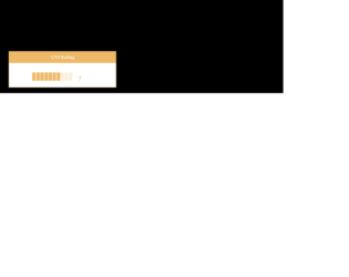
This is an example of a rating bar with hover effects, designed using HTML, CSS, JavaScript, and Bootstrap framework 4. Media quarries have been used to increase the responsiveness of the form, and the JavaScript functions have been used to implement the rating function. The body of the form is given a background color of #000000. The background color of the rating bar is set as #fbedd9, which changes to #EDB867, in a hover event or while rating. The current rating is also indicated by the #EDB867 fill color effect. The rating bar is given the styles of display as block, width as 12px, padding as 5px 0, height as 28px, and float as left. The current rating value is indicated with the styles of font-size as 20px, line-height as 2, float as left, padding as 0 20px 0 20px, and font-weight as 400.
Source: https://bbbootstrap.com/snippets/bar-rating-1-10-97482935
Bar rating 1 to 10
4.3.1

This is an example of a loading bar animation, designed using HTML, CSS, Bootstrap framework 4. The body of the form is given the styles of display as flex, justify-content as center, align-items as center, height as 100vh, and background as #ECEFFC. The implementation of the loading feature has been done by giving different animations and styles into four bars. The loading container is given the styles of position as relative, width as 45px, height as 45px, and a transform value as rotate(75deg). An individual bar is given an animation of 1.5s cubic-bezier(0.645, 0.045, 0.355, 1) infinite. The first child element is given a background color of #0984e3, and an animation style of slide-bottom-top, whereas the second child element has the background color of #d63031, and animation style of slide-left-right. The third and fourth ones are given the background colors and animation styles of #fdcb6e, #00b894, slide-top-bottom, and slide-right-left, respectively.
Source: https://codepen.io/alphardex/pen/abzaxBB
Bar Loading
4.3.1

This is an example of a navigation bar with expanding effects, designed using HTML, CSS, JavaScript, and Bootstrap framework 4. The fonts are imported to the code with its URL whereas the JavaScript functions have been used to implement the expanding function of the navigation icon. The concept of Lists has been used with UL and LI components. UL element has been used with the child elements of LI to display the child elements of the navigation bar, in an orderly manner. The body of the form is given the styles of background-color as #28363D, font-family as "Roboto", and color as #fff The button is given the styles of width and height as 50px, margin as 70px 97px, padding as 10px, and cursor style as pointer to get the hand cursor effect on a hover event. The menu container is given the styles of overflow as hidden to hide the content when inactive, background as #212121, width as 250px, box-shadow as 0 0 10px #000, and transform as translateZ(0) translateX(-100%). The child elements of the menu take the style of text-decoration as line-through, in a hover event.
Source: https://codepen.io/MilanMilosev/pen/GJbGJq
Navigation Bar
4.3.1