

This is a keypress event where a certain element gets focused when the key that starts that element is pressed down. This is written in JavaScript. To handle the keypress event, the “key-down” function has been used in and to validate it to work only for alpha characters, a list has been declared with all the alphabetical characters with its Hexa value. There are three functions used here; handleAlphaKeyPresses, matchElemToKey and cycle focus and the use of them are respectively, to apply the keypress event, to find all the matching elements and return them and to make the “li > an” element. CSS styles have been used to apply mouse hover styles with the “hover” class and to apply the styles for the selected div with the “focus” class.
Source: https://codepen.io/miclgael/pen/LJJvyP?&page=1
This code is used to design a responsive navigation bar where it dynamically changes according to the screen size. If the screen width is greater than 700px, the “nav-bar” class will be displayed and “small-navbar” will be hidden and vice versa. The style “display” is used with the value “none” to hide the visibility and the value “block” to make it visible. To identify the screen size, the media screen attribute has been used by specifying a min-width. The input element has been used with its type checkbox to display the clickable div; its clicked events have been handled by applying the styles when checked and remove the styles when unchecked.
Source: https://codepen.io/jewel998/pen/exVpQK?&page=1

This is an example of the mouse hover effect using pure CSS styles without any JavaScript’s. The slide in animation allows expanding a menu when the mouse cursor hovers over the div whereas the slide-out animation closes the menu when the cursor moves out of the div. It uses the “transform” style to slide in and out of the div. The translated is used to make the slide in and out horizontal. The hover event in styles has been used to append the styles when the cursor gets on a specific div. The “text-transform” style has been used to convert the given HTML text into uppercase automatically by setting its value to “uppercase”.
Source: https://codepen.io/codboy_3/pen/pmMzzp

This is a creative style menu option where the columns are expanded to display the menu items. The Navigation bar itself is displayed with the menus at the bottom of the page. This can be used in your web pages instead of the navigation bar. This is best suited for less number of menu items. Each page is opened when clicked on the menu which is expanded using javascript. The color combinations and visual plays an important role than the menu and design. The animation effect is an effort of CSS and javascript for its simple and clean code. The design is responsive and takes a different view altogether in mobile devices. Use this for your personal websites where menu items are less in number. The CSS needs to be perfect for such kind of web page. Make sure your page has color matching to this template while using this on your site.
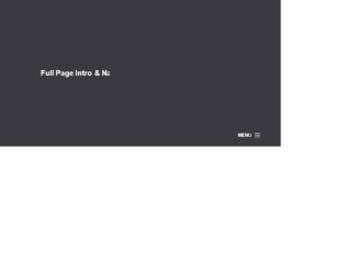
This is an example of a full page into and navigation menu. This uses the creative style of designing navigations for the web site. The menu is at the bottom and uses the hamburger navigation menu. On clicking the menu icon the navigation menu is displayed from the top of the page, covering the complete page. In order to dismiss the menu, you can click on the cross button on the right of the page. This style fits for photography website template. The navigation menu bar can be used to show the mega menu items like on the e-commerce website. You need to have a javascript running to display the menu items and their effects. The CSS is the best to match for the website. You can use this as an example for the creative website and tweak as per your requirements and menu links.