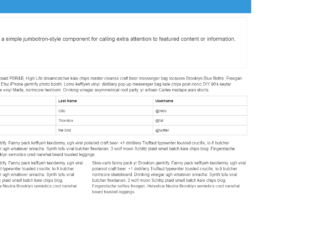
This is an example of a bootstrap admin panel interface with hover effects, designed using HTML, CSS, JavaScript, and bootstrap framework 4. The icons and fonts are imported to the code with their URLs whereas JavaScript functions have been used to implement the hover effects on the sidebar. The concept of Lists has been used with UL and LI components. UL element has been used with the child elements of LI to display the details in an orderly manner. The body of the form is given a style set of background as #f5f5f5, padding as 0, margin as 0, and font-family as 'Lato', sans-serif. The sidebar icon names are given a font-size of 16px, whereas the content is given the styles of font-size as 16px, and line-height as 1.428571429. The header section of the form has the styles of background as #3498DB, width as 100%, height as 50px, line-height as 50px, color as #fff, and the logo is given a font style of uppercase to automatically convert the text to uppercase. The sidebar list takes an animation of swing, in a hover event.
Source: https://codepen.io/lsmithx2/pen/qBELwGa
Admin Menu
4.3.1
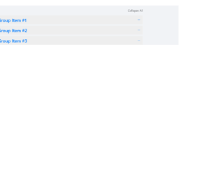
This is an excellent example of the accordion with “expand all and collapse all” button. The HTML is simple with the bootstrap accordion with the panel and data-toggling behavior defined. The CSS defined the styles for each tag, check out the “:: after” selector tag, which selects the panel-default and panel-heading and add the given styles after they are selected. Notice the change in the expandable button which is at the right of accordion, once clicked it rotates 180deg, this styling is done using CSS for aria-expended. This indicates the state of the collapsible element. This aria-expanded can be used with menus or list or any other collapsible items. The expand all and collapsible all button work using javascript. Check out the functions which open up all the accordion when clicked on "expand all" and "close all" when clicked on close all accordion. Use this to your website with large content and paragraphs.

Generally, accordions are used with collapsible and toggling behavior. But this example shows you the combination of color schemes such as primary, success, danger, etc. The snippet is using the container for the responsive behavior of this design, the panel-group class is used which includes the panel-heading, panel-title, panel-body. You could also include the panel-footer if needed. The panel-default describes the color scheme for the accordion. Panel container different classes for color such as panel-primary, panel-success, etc. This is defined for each panel in panel-group. Each panel defines the buttons for previous and next accordion to open. Button click functions are taken care of by the javascript file. The CCS just defines the top-margin for the accordion, color scheme and fonts is taken care using the tags used in HTML. You can use these types of the accordion to display some new or important announcements on webpages.