Being a specific form of art, typography has always been coherent with the general progress of art and cultural growth of humanity. This is why the history of western typography reflects the development of art in Europe to a considerable degree. The epoch of Roman Empire, Renaissance, Baroque, and the art of Industrialization period – we can track the traces of each stage of art development in the design of particular typefaces, born during a respective period of time. In fact, the whole history of western typography has always been about the development of new trends, and the revival of ancient techniques of writing and lettering designs.
The below article aims at providing key facts from the history of western typography supplied with modern font examples, which could represent and illustrate the font styles, specific for each stage of typography development.
Today thanks to the rapid development of computer technologies and digital fonts, a new chapter of western typography history is being written. Along with multiple modern fonts, reflecting the modern art ideas, such as graffiti or 3D effects, many font designers still do their best to give new life into ancient scripts, developing professional fonts based on old typography rules and classical typefaces, which have already withstood the test of time.
Modern terminology explains typography as the art or technique, which deals with arranging type, type design, and glyphs appearance. Since this craft had different courses of development in Asian region and in Europe, it is a commonly accepted approach to differentiate Western typography from that formed in other places of the world.
At the dawn of Western Typography
Middle of the 15th century is usually associated with the dawn of the Western typography as the systematic craft. Though the design or appearance of letters had been evolving during many centuries before, it was in the 15th century, when the first types, fonts, and typefaces appeared, owing largely to the rapid development of movable type printing.
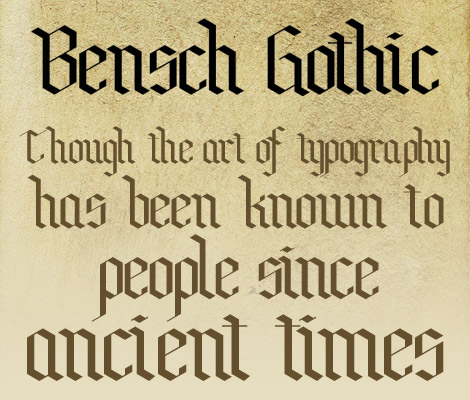
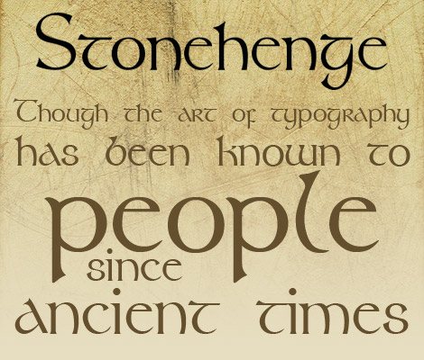
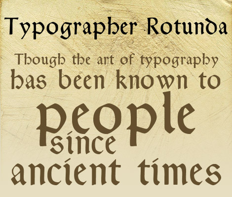
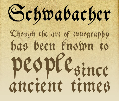
The first typefaces, which appeared in Europe, such as D-K type (around 1455) for the first book printed in Europe, had distinct gothic blackletter traits. Bensch Gothic font can now be used to show how those first fruits of Western typography looked like. Later under the influence of typographic traditions and trends in Italy new typefaces were presented: Bastarda, fraktur, rotunda, and Schwabacher. Those typefaces featured distinctive professional design with structurized and highly organized glyphs. Modern computer fonts Stonehenge Regular, Breitkopf Fraktur, Typographer Rotunda, and Schwabacher mimic the appearance of the mentioned medieval typefaces.
Bensch Gothic
Stonehenge Regular
Breitkopf Fraktur

Typographer Rotunda
Schwabacher
Old Style Types during Middle Ages
The design of inscriptional capitals, found on Roman buildings, formed the background for the next step of Western typography. Structurally appropriate design, angled stresses, contrasting strokes, and serifs became the characteristic features of the traditional typefaces ever developed by Western typography artists.
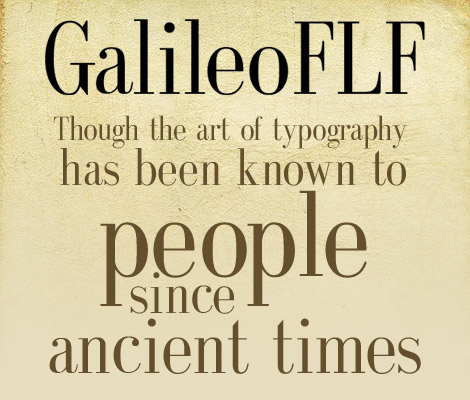
By the end of the 15th century a Roman type was formed thanks to the works of Nicolas Jenson, Francesco Griffo, and Erhard Radolt. Nowadays, the representatives of Roman typeface family, for example Justus Roman, Grandesign Neue Roman, GalileoFLF-Roman remain among the most popular typefaces, widely used in multiple practical applications.
Justus Roman

Grandesign Neue Roman

GalileoFLF-Roman
Typography during the Renaissance
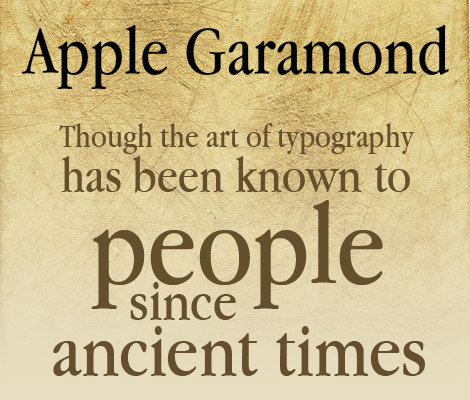
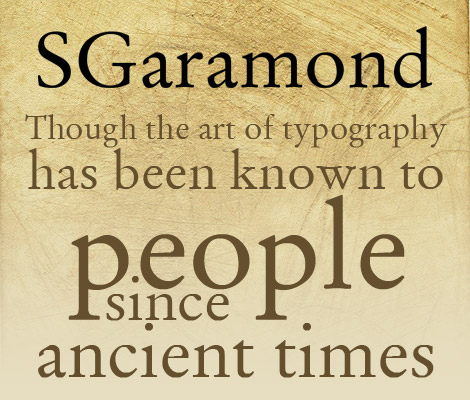
The epoch of Renaissance brought a new style of writing, known as “cursiva humanistica”. The slanted glyphs design gave birth to a wide range of Italic or cursive typefaces. A great contribution to the development of Western typography was made by Claude Garamond. He developed the typefaces, known as “Canon de Garamond” and “Petit Canon de Garamond”, which became the prototype for modern Garamond style fonts, such as Apple Garamond, SGaramond Regular, and others.
Apple Garamond
SGaramond Regular
Transition to Modern Style
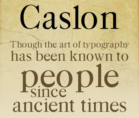
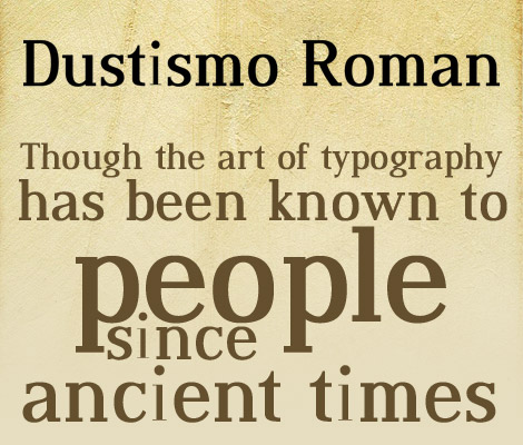
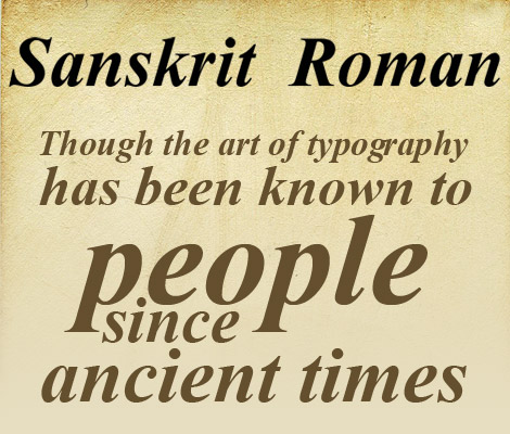
The 17th and 18th centuries introduced new trends in Western typography: the letters received greater contrast between thick and thin strokes, bracketed serifs turned into fine almost straight lines, and the stressing became vertical. William Caslon, Johann Fleischmann, and John Baskerville made notable contributions to the development of the so-called transitional Roman typefaces. Caslon-Bold, Dustismo Roman Bold, Sanskrit Roman Bold Italic fonts inherit the best traits of this particular tradition in western typography.
Caslon-Bold
Dustismo Roman Bold
Sanskrit Roman Bold Italic
Western Typography in 19th-20th century
Due to the rapid development of industries in the 19th and 20th century, typography again made a significant step forward. Though experts say that this period was not marked with any novelties in the typefaces design, great progress was made in terms of typographic technology. After the invention of lithography in 1796, typography was popularised over a wide range of applications from newspapers to posters and advertisings.
Modern days of Western Typography
With the appearance of personal computers at the end of the 20th century, a new round of western typography has begun. Now, font designers are no longer limited with the specifications of the metal types, a new font or typeface can be designed in a relatively easy way with the help of specialised computer applications or font editors. Computer fonts are now widely used by every user of personal computer, which gave the push to the appearance and growth of the huge free font repositories in the Internet, such as Fonts2u, where anyone can find a great variety of digital fonts, download them and use in personal documents or designing projects.
Christina
Thank you, this is a great post! An excellent resource if you are trying to recreate typography of a certain era and a nice summary of typography history :)
Fidget
It’s always nice to know where something comes from, to get a better knowledge of the background.
Nice to see how fonts developed over time.
Simon
Nice post, especially all the different types of western typography.
Really love the Grandesign Neue Roman type.
Albert Lie
Western typefaces are very unique & cool. I like them used for ancient theme advertising.
Kate Madigan
Thanks for this great article! It’s useful from a design perspective to know in which period different typefaces arose – and it’s really interesting too.
Cook
stonehenge regular…is really awesome……very interesting post…loved it
Bertrand
Nice fonts showcased here. Thanks, it’s always nice to know where it all come from…
Joel G
Sorry to point this out but you know your post image has mispelled “History”? It says, “Histoy” (missing the “r”).
I figure since it is a post on Typography, after all, I’d point out the “Typo”.
Anyways, nice article!
Glynn
Hey, I was just wondering if anyone knows of any good books to start of with about Typography. I design websites and multimedia applications and although I’m good at the design side I tend to be a bit reluctant to experiment with typography. I just need a little bit of theory and some good examples really of when it’s best to use certain fonts etc.
Cheers
Oh and good post as always!!! :)
lilian
Typography has always been coherent with the general progress of art and cultural growth of humanity.
Manuel
Thanks for this great post :-)
Very nice fontlist, my favorite is Stonhenge Typeface!
Chris Hunt
“Though experts say that [the 19th and 20th centuries were] not marked with any novelties in the typefaces design”
Apart from the widespread use of sans-serif fonts, that is. A history of typography that doesn’t include Helvetica? I think you need to get some better experts!
Manisha
very nice post…. i like your fontlist the most….
Carl - Web Courses Bangkok
Ohh great for our Graphic Design Course, we will reference this article.
Thanks!
C
Turk_Navy
Nice fonts showcased here. Thanks
lava360blog
good to know about the history of western typography. useful info
Tim
Really like Caslon-Bold. Nice round up.
marina
Free FITC Toronto 2010 Ticket ok!!
henri
good reading :D thanks.
kgordon
Typography throughout the ages has changed drastically, while still upholding some of the consistent aspects such as the use of Serif or Sans Serif fonts etc. I agree that it has always been coherent with the general progress of art and cultural growth of humanity, and that it reflects the development of art in Europe to a considerable degree. I believe the transition to digital from metal type is a significant improvement, and Typography will continue to develop and change throughout time. The changes have been consistent with the culture of the times, like the use of serif fonts, contrast between thick and thin strokes, slanted fonts, and uppercase fonts, to the appearance of smooth digital fonts that can have almost any degree of thickness. The ability to download fonts, now, also assists in the transition between the western fonts and today’s culture as we are in the Media-age. This is a great article, however I believe there could be a broader range of fonts represented in the history.
Jeff Kahn
The Caslon sample is very poor. Please replace it with an accurate version.
AHWebArt
This is what i wanted to know, informative article and like to bookmark it.
Katrina Hase
Thanks for this post. Too often people select a font because it looks good, and don’t understand the historical meaning it conveys.
larissa
great post :D
Web Design
very informative i love learning new things..THANK YOU
Julia
Hmm… I will be using some of those in my new design project. Thanks a lot!
Mark
Nice little summation! I was unfamiliar with a few of those typefaces, and i am grateful for the introduction!
Web designer
I have always been a great fan of western typography. This is an awesome article!
Design Hippo
Great list of diverse fonts. Thanks
yohan
thanks for sharing :) nice post
arieff
Thanks for this post. Too often people select a font because it looks good, and don’t understand the historical meaning it conveys.
keep sharing :)
ardhan
i love web art :D
utari
so cool typography..
sunny
Thank you!
IT Consulting
Fraktur is famous for fairy tale books, right? Cool.:D
code pixelz media
wonderful article very helpful indeed.
eric
thanks for share… :)
very nice…
Kojeje
I like the western topography..
how about the eastern…?? :)
Web free fonts
Cool List.. you can also submit your font in my website
Nakul
Very Nive Article Thnx for sharing this post
ospop shoes shop
Very well written article, thank you.
it support tampa
Hello, I was interested in a typograhy wholw my life, my grandparents are from another country and they worked both in publishing company years ago. I heard a lot about it from them and now, got some new knowledge from your site, thank you!
Melvins
Wonderful article as well as I like western topography so much. So I would like to specially thanks to you.
Los Angeles Web Design
Lotus Notes development
Great fonts would like to use one of the fonts our Lotus Notes development environment Lotus Notes support
legalnurse consultant
interesting to find some of the history behind the wester typography .
thank you for sharing
dentist palm harbor
thank you for sharing it
new smyrna beach fishing charters
great article & i am sure it took time to put it together
volcanovaporizer
Vaporizers are designed for home use and moisten the air inside, especially during the winter, allergy season and cold and flu season. Vaporizers take water and use heat to create steam. The steam is released into the room, increasing the overall humidity. This can provide several benefits for you and your household.
Henry Peise
Latest iphone 4 white Conversion Kit with white color is now available, Let’s try!
Juno Mindoes
I love iphone 4 white, and i will keep focus on it. But when will it really release, hmm let’s see.
mikwillson
That is to be expected in a long-term, high-risk project like ours. So, we turned to the blogging community for help – and got it! We have published our problems, and the community responded with results!uggs outlet
Ben
Everyone has his own way of life, the firm faith, believe they can live very fascinating!
altın çilek
Vaporizers are designed for home use and moisten the air inside, especially during the winter, allergy season and cold and flu season. Vaporizers take water and use heat to create steam. The steam is released into the room, increasing the overall humidity. This can provide several benefits for you and your household.
hcg damla
Everyone has his own way of life, the firm faith, believe they can live very fascinating!
Khalid Majid Ali
Very informative, thanks a lot
Saex
Lame -__-
susan
I agree. Lame and incorrect. Misleading.
orhanbt
This is verry good
ห้องน้ำ
This can provide several benefits for you and your household.
Moliva
Misleading.
Abhishek
Hi ! friends sunglasses are really an mandatory objects these days. It not only enhance your look but sometime your overall personality. So do not wait come to gkboptical.com and buy online your spectacle online .
excel consultants
I am an excel consultant and access programmer with expertise in advanced Excel formulas, modeling, macros, and VBA.