Guest Post by Joel Reyes
Web designers always have to strike a balance between usability and visual appeal when designing a website. Without this balance, a website might be nice to look at or difficult to navigate. Or, it might be easy to navigate, but not easy on the eyes. With this in mind, balancing attractive navigation with usability does not need to be overly difficult. To help you generate new ideas and inspiration for user navigation, here are 30 great examples of attractive and usable navigation.
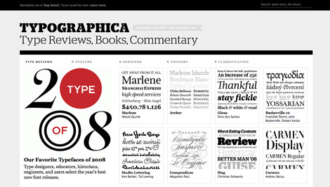
Typographica
This site features the simplicity of an attrractive menu that empowers users with undeniably easy to follow navigation. If you hover over the headline under the logo you will see that the word "Type" remains highlighted, and as you begin to hover over the rest of the words you’ll be able to clearly select the corresponding area you’d like to visit.
Atebits
Links are in the form of icons that feature a neat effect that allows the icons to light up as you hover over them. It’s simple, subtle, attractive, yet effective.

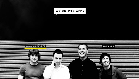
Contrast.ie
The navigation on Contrast.ie displays a unique approach to creative styled menus. All of the buttons are placed in a comment shaped figure and pop out as you hover over them.
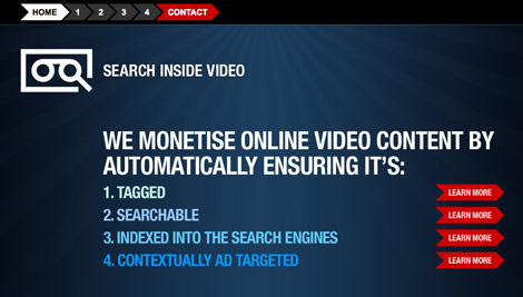
Search Inside Video
The navigation on this site clearly directs you in the form of an arrow as you hover over them with your mouse. Effective navigation leaves behind complex design. Seems as though this site made use of this suggestion.
Leihu
This site takes creative navigation to the sky. If you look to the left and mouseover the guy you will see a smile appear, if you mouseover the icons and images you’ll instantly see a description next to the mouse’s pointer as well.
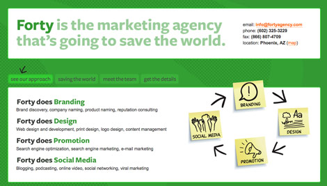
Forty
Forty uses a creative, image-based user navigation. The arrows “guide” the users attention to the buttons and invites the user to click on them.
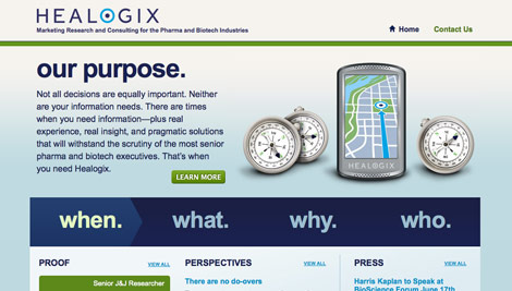
Healogix
Healogix asks the four most important questions of itself with large text that draws the users attention. When, what, why and who? Can all be answered one click away from the homepage.
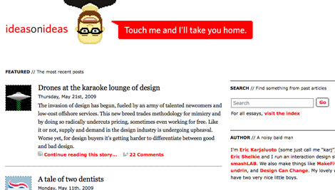
Ideas on Ideas
There is only one main link to the home page, but the idea is both creative and usable. The link is prominent and it “speaks” to the user. Users, in general, enjoy web pages that they can interact with.
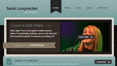
Sarah Longnecker
The navigation of this website is simple and easy to use. The banners behind the selected page make the navigation easily identifiable from the rest of the page.
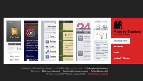
Made By Elephant
Made by Elephant features large and easy to use navigation. The blue text also adds a nice contrast to the heavier red and black.
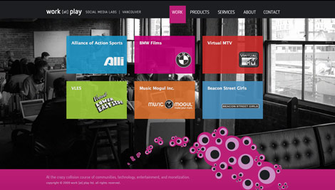
Work at Play
As you begin to click through the menu of this site, you’ll be able to notice that the position of the background and color of the entire site quickly change.
Clear Left
The menu on this site resembles that of a post it note as you mouseover the links. Then entire layout of the site is based on this concept.

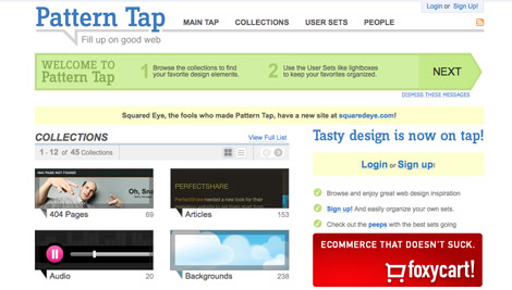
Pattern Tap
As soon as you enter the site you’re greeted by a green arrow that feeds you information about every section as you scroll through the site. This makes it easer for users to interact with the site.
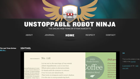
Unstoppable Robot Ninja
The navigation is as bold as the name of this website. Furthermore, it also enhances the design tremendously.
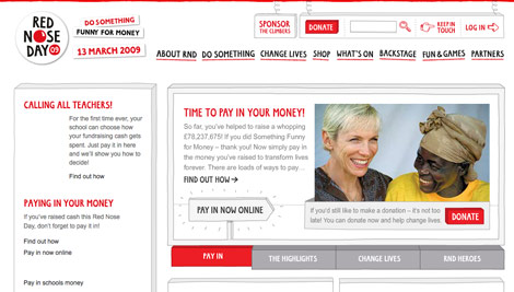
Red Nose Day
The main navigation links fit in well with the playful theme of the website, while maintaining usability and prominence.
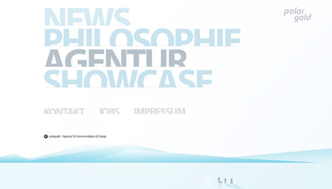
Polar Gold
This text-based navigation features a colorful and playful look while maintaining usability without the use of Javascript, but Flash instead.
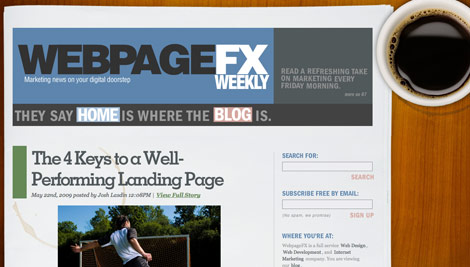
Webpage FX Blog
A unique and interesting take on navigation. The links to the home page and blog are featured in a sentence across the header of the page. It does not violate usability principles, it is easy to read and highly effective.
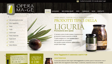
Opera Ma-gé
The main navigation is easy to find, and the green underline creates uniformity between the navigation and the rest of the page.
Owltastic
Owltastic is a perfect example of good user experience. Every element of the main navigation animates when the user hovers the mouse over it. Like other examples on this list, the navigation is also prominent and easy to locate.

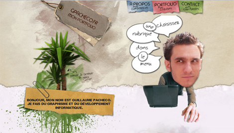
Guillaume Pacheco
Like Owltastic, this website interacts with the user as they mouse over different elements of the page. The site is well laid out and easy to navigate.
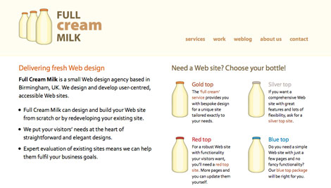
Full Cream Milk
Full Cream Milk uses a distinct text-based navigation, as you roll over the links, a portion of the top of the page is highlighted. This is a great example of navigation that is pleasing to both users and search engines.
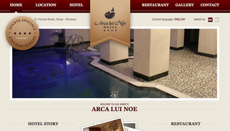
Arca Lui Noe Hotel
This site features user navigation that is both beautiful and easy to use. It is very stylish and adds to the overall design of the page.
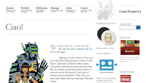
Sushi & Robots
Sushi and Robots uses elegant Typography to create a beautiful and attractive navigation that stands out.
Sharify
Sharify features a monochromatic user navigation that is pleasing to the eye, and usable because of the contrast between the white text and the sky blue background.

Stephen Caver
Here, the navigation is essentially the first content you see on the home page. It is “clean” and easy to use. Moreover, the use of whitespace in the navigation is excellent.

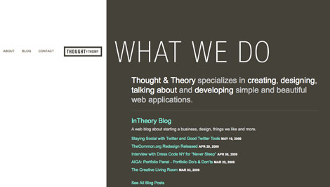
Thought and Theory
This site takes a minimalist approach to navigation, and it simply works. It does not take anything away from the page or distract the user.
Slightly More
Again, the high contrast black and white adds to the usability of the site. The javascript rollovers are light blue tabs that add interactivity and aesthetic value.

Ulster Grocer
The navigation makes use of bright colors, easy accessibility and unity with the blue background of the main content of the page.

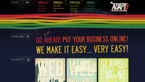
Adaptd
The Adaptd site features creative, easy to follow, and beautiful navigation. The aspect of this navigation that stands out the most is located in the section where the portfolio resides. When you place the mouseover these buttons the words become transparent blend in with the sites background.
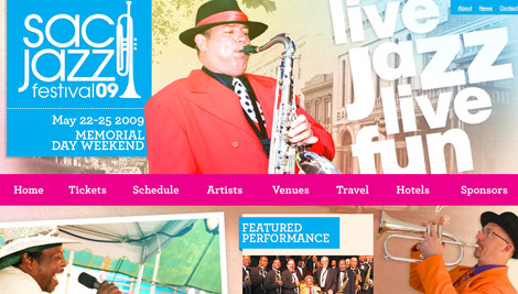
Sac Jazz Festival 2009
This site has navigation that the user does not even have to search for. In addition, the vibrant color of the navigation adds even more color to the page. The elements of this design blend together seamlessly.
Ryan
Great post! Really good collection of websites. I love seeing a good list of well designed websites.
CreamScoop
Amazing list, some really good sites.
div
Words will fall short………..
Daus
Nice roundup. Love how contrast.ie configure their navigation.
abhay
excellent collocation dude.. I’m always looking for this kind of inspirational things to design unique
Haris
Beautiful.
What else can I comment? All of them are exceptionally beautiful websites. Apprasing each of them one by one will take a lot of time and just add bloat to my comment.
Vim
These are some really nice websites, each unique in its own way, one that stands out is to me is Work at Play.
manuel
interesting list again. thx
Phillip Smart
I’ve just started making my first site and wow, all this just seems miles away.
Great stuff, love the inspiration, keep it coming.
DKumar M.
Nice collection nick…. thanks for sharing !!
DKumar M.
@instantShift
Serkan
its all Great.
My fav: http://www.webpagefx.com/blog/
Benjamin Reid
If it looks good and it’s still user friendly then they get a tick in my book.
webadelic
great list, will add this to my favs.
Wedge
I feel it’s easier to create usable, attractive navigation when you’re asking people to view just four sections, or just four pages. It’s much harder when you’re site has a lot of *content* and requires drop-down menus.
Altitude Marketing
Thanks for featuring one of our latest projects, Healogix. Much appreciated!
Some really great stuff in this list. :)
Iria
I always thought that http://www.operamage.com was an extremely beautiful website, it stands out in this awesome list of awesomeness :D
David Costales
Nice list, thanks!
KChristoph
Greatings from Hannover, Germany.
Thanks for inspiration.
David
Thats a really nice list thanks. It seams to be so easy for web designers to fall into the trap of using the same or similar navigation on every site they make. I agree with Wedge about larger sites with drop downs but it’s easy to forget how creative you can get with navigation on smaller sites without compromising the usability.
Brian Cray
Very cool roundup.
mabonic
thank (^_______^)
Cassie
This post makes me wanna scrap all my websites and start from scratch. Very cool and inspiration navs and sites in general.
Radoslav Holan
It shows again there are really no borders. Something is more useful, something is more hot. But anyway, it’s again a nice post in here, useful and inspirative. Thanx
Julian Young
Lovely compilation, nice mix alhough some are clearly not very attractive! :) Thanks!
Creamy CSS
Nice list,.. Made By Elephant navigation menu is great!
Jurgen
Some are really cool and others not so… beauty is in the eye of the beholder! Thanks for sharing.
Michael Armsatti
About time you posted something good again, this site was going to crap and boring
Dario Gutierrez
Some sites are great but others not.
Jesse Korzan
Thanks for including our site!
Joel R.
Thank you for your comments!
abhishek
your posts inspire me to be a web designer! thanks
Yuda
nice compilation, thanks for the post
Adam Akers
Another great list of examples. Another list to be bookmarked into my favourites
aledesign.it
Another fabulous post! Arca Lui Noe Hotel, Guillaume Pacheco, Typographica are my preferite. Is important to see a different NAV in the net..every graphic have a lot fo idea after see this post!
theodin
great article as always, thanks for sharing!!
kamalakar
hi, it always a pleasure to visit ur website. it gives me a great deal of information on what is going on in the design world as i dont get much information regarding global webdesign trends in my country india. but i was wondering on what basis do u search for these websites and how would u decide on which one to showcase when each other website would have its own speciality?
Aneslin
great bunch of collection,
thanks a lot bro
roberto
There are some really nice websites there, it’s cool to see (don’t know if it’s a trend) moving backgrounds and slides.
As always thanks for sharing…
Roberto
Sklep Zoologiczny
Simply genius !
@cwylie0
Beautiful list. I am always looking for good inspirational design examples to help me along in my journey.
Egypt Web Design
Woww Thanks for all your efforts, it’s defiantly an added value for all the designers and a good way to show appreciation for the hard worker designers :-)
Thanks,
Mohammed
aaaaaaaa
aaaaaaaaaaaaadddddddd
webdesign - bevisual
Thank you for this very nice List!
Halim
Thank you for all the inspirations!
- Toby -
Thanks Nick! Nice Inspiration!
IdealHut
Great selection :), you can also check navigation bar at my portfolio as well…
zrce
great collection. thx
Rivki
Great inspiration for me… thanks a lot…
TWMG
keep up the good work
brilliant
Jason Grant
Very nice stuff.
Design is a very important aspect of any web site and navigation can be one of the hardest things to get right and make it pretty.
Simon Erich
I have mixed emotions when looking at a list like this. Attractive – Yes. Effective – Mostly. But these are some very limited views on what “navigation” really is. Are we talking about the 4-6 links at the top of a homepage? Or are we talking about how to make a deep, content rich site easy to use for the visitor? There are some very nicely designed sites in this list, but many which “break the rules” of standardization of navigation and labeling.
All that being said, thanks for putting together this attractive and inspirational list! I’m sure it won’t be the last time I visit, keep up the good work.
Iza
I agree with Simon Enrich. The sites are attractive and it is great to see so many talented designers on the web. Unfortunately, some of the sites from this list will be frustrating, confusing or even impossible to use for a keyboard user. In most cases this problem could be fixed by simply using device independent JavaScript handlers. Sites should be attractive but they are not paintings in a gallery or printed brochures – we should be able to get beyond the home page, with or without the mouse (e.g. mobile phone).
dsa
afsd
mindpro
inspiring
backusdesign
Ewww, number 4 uses sIFR.
Web Design Hobart
I like the custom layouts the most where the navigation is enhanced with creative hover texts. All navigation here seem to keep usability in mind as well and that is very important.
Fred Campbell
What a great list! Plenty of great website designs to plunder for inspiration! Thanks
Deepak
Gr8 Collection !!!! The most important function of a website is to be very attractive and easy navigation , user friendly and communicative.
Carl - Web Courses Bangkok Instructor
Great examples thank you!
Michelle
I love these examples!
Thank you!
div
Very Informative, inspiring…..
burak - delizade
bunch of great sites…gatheing them is a holy effort. thankyou
Pavel Kuts
nice owly site. made browse through more than the rest :)
nesnora
Most of these sites have less than 10 links/pages. It would be nice to see something more than just artist portfolio sites. Solutions for huge, data-rich sites would be interesting… this stuff is (mostly) pretty, but not exactly inspiring.
diyet
It would be nice to see something more than just artist portfolio sites. thanks
Nicolas Borda
Nice to see a Drupal site like Red Nose Day in the list!
kiera
still learning so much about websites. not a designer but need to know this info for my clients. thanks for the lesson.
Attitude Design | Graphic Design Portfolio
Thanks for this great selection.
Joe
(comment removed by admin)
Rob
Fantastic!! Thanks for posting these examples of awesome navigation! I’ll admit, it can be real exciting adding different design touches to the navigation!
I tend to design the navigation based on the style of my website. For elegant designs, I tend to use subdued text for links or maybe a subtle roll-over. The hotel website listed above is definitely an elegant type of roll-over!
I think it’s probably important to note that when doing roll-overs, image based roll-overs should be done with CSS instead of JavaScript. The JavaScript is a bit clunky and CSS just makes it a little cleaner. Just my personal opinion!
:) Rob
Rob
@ Joe…I don’t think your rude behavior is appreciated by anyone in this forum. I would automatically delete your outcast behavior, and so should the designer of this website.
There’s no need for your attitude. Take it somewhere else!!!
Bernard Teske
In this webside, http://www.druckundrepro.de you can use the navigation in the left side or use the cursor like a “hand-tool”. Think this is also an interesting way :-)
matrax
Your site and your content to a really great hand healthy;)
yapidekor
Thank you my friend …
egypt web design
great article thanks for share with us, really great list.
London web design
Yeah this is well nice!
Nashville Web Design Guy
Very diverse range of styles and functionality on the list. Very nice compilation. I tend to lean toward linear navigation if it can fit at all into a project. I like to lead people through the experience. It’s not always feasible of course but a nice change for users and it allows you to gauge interest pretty easily via analytics.
Jessie Matanky
I really liked these- these sites seem to be up on all the blogs & web design sites for all sorts of different stuff. They should be proud.
shesh
this site rocks for a post like this :D
Stephen Kui
I really love some of these navigation examples.
Just one thing I’ve found and noticed is no matter how good a navigation system looks, if it’s not easy to figure out, it doesn’t work for me.
So when I design I always make a habit of trying to keep the navigation stylish and different without making it totally confusing. (if you want to see what I mean it’s on my site at http://www.stephenkui.com)
Does anyone get what I’m saying or even agree?
cennetevi
these are awesome!
thanks for putting in the effort to get this list together
Clinton Montague
@chris – it’s nice to know that some people look at it! Thanks for the kind words!
free style
oh more attractive…
Cookie Creative - Graphic Design Manchester
Wicked collection, thanks. :)
Huge
Atebits is cool design. Really interesting things here.
Diane
I LOVE the “Work at Play” Site. Awesome example of creative navigation. I’m curious how they did it. Is it as simple as anchored links with a sticky header & footer? Or is there more to it? Hopefully this doesn’t sound too much like a newbie question.
Although…. it would make for a really cool tutorial. Hint, hint :-)
bagsin
Be sure and check out the page source for the Slightly More site
Louis
Some of them are really nice.
However, some of them seems with a bad usability :(
Nice article anyways.
Rob
Some great examples there. Great post.
Mike
I really love some of these navigation examples.
panel radyatör
good tutorial thanks
egypt web design
thanks for the nice collection
Discount Mole
some amazing designs so jealous :()
panel radyatör
nice tutorial i will translate my language
Daniel
another great 2010 incrasing webtrend is the horizontal scroll, keep this example using jquery: RossoCarmilla.com
vincentdresses
喜欢你们的设计与技术,常来看看
zonguldak halı yıkama
excellent article i learn so thşngs
Kirsten
lovely designs ….great job
brandon
exceptional stuff.keep up the good work
Alex
amazing article…
Michael Müller
How do you find this site http://www.kroati.de?
Lauren
Nice! This gives me some good ideas
Web Design
I LOVE THIS SITE!! thank you for sharing
London Web Designer Evan Skuthorpe
some inspiring design examples here… bu not quite what im looking for… must keep looking.
a_sillyguy
hi frnd..great collection ..really helpful..and handy thanks ..
would u plz help me ..by telling how to design these websites using visual studio..or at least u cud give me some tips..on the links i should view in order to master these design courses..
Melvins
A well-designed website has many things like creative graphics, interactive animations, powerful navigation structure, and of course relevant content. But apart from all that, navigation plays very important role for any website. Navigation should be clearly defined and easy to understand for any visitor. So that visitors we go to any part of the website without any difficulties.
Web Design LA
Web development Cambridge Ontrio
i think its a perfect solution.
Rex Liu
Would you be willing to give your recommendations for the Internet Marketing Services company I currently work for? Any advice would be much appreciated. Thank you in advance
Souvenir Berlin
nice ideas and collection thx
ertamen
When you do article marketing, your intention is to increase the number of visitors to your website. It is not our abilities that show what we truly are, it is our choices. I have look for such a article for a long
davids
When you do article marketing, your intention is to increase the number of visitors to your website. You can do this by writing and submitting unique, quality
Design
part of the website without any difficulties. uggs outlet
Henry Peise
The modern and delicate makes iphone 4 white so charming that even me, want to own one. But what i can do now, is to wait the price to decline.
Juno Mindoes
Still wonder white iphone 4 avaiable or not? We tells you the answer is "yes". Now you can buy the hottest white iphone 4 Conversion Kit and make a change!
aaron
It is one of the best site i never seen.
Ben
Just saying thanks will not just be enough, for the exceptional lucidity in your writing.
Cygnismedia
Thanks for sharing your experience with us…
Facebook Applications Development
please keep posting your reviews….
altın çilek
That’s Great! Thanks for the post!
hcg damla
When you do article marketing, your intention is to increase the number of visitors to your website. You can do this by writing and submitting unique, quality
Heather Williams
I really love your site. Great sharing on the 30 WP sites and attractive nav. Superp work!
how to put on a condom
Exceptional post, buy can you right more about this? It is currently my field of study and I would be thanful for more information.
Caputo Designz
I love the list of navs! If anyone wants to check out a 100% free and pure css navigation with rounded corner drop downs go to : http://caputodesignz.com/blog/?p=99
thermal vision monocular
Thanks for every other informative web site. The place else may I get that kind of information written in such an ideal method? I have a undertaking that I’m simply now operating on, and I have been at the look out for such info.
complex41
And then he handed you the thirty-five 45
δονητές
I love your blog.. very nice colors & theme. Did you create this website yourself or did you hire someone to do it for you? Plz respond as I’m looking to create my own blog and would like to find out where u got this from. thanks a lot
anthony
goddd u really suck
Brian
Awesome list, thanks for the share.. Love the site !
Commedia Courses
Good stuff and good inspirational works!
Article Marketing Italia
I love the Leihu template, It’s really a nice wordpress template!
agenzia seo
Arca Lui Noe Hotel is great and attractive template! Really cool!
TextureTaddka
Thanks for making these novel web design ideas available together. I liked Ideas On Ideas and Polar Gold.
Free Logo Design
I agree with you that navigation has significant importance. As far as the home page is concerned, it should be accessible and convenient.
Permade Free Logo
Its great and amazing collections of designing of web site.
Free Vactor Download
Its a great and very very easy websites to using .
Permade Free Logos
I really like the unstoppable robot ninja.. All examples are fascinating.
Mutui
Sac Jazz Festival 2009 is great for music blog
ccc
ccc
Kev
I think responsive navigation is the best way to go so no matter what device your visitor is on the navigation will look good. So one visitor could be on an iPod, one on a widescreen desktop computer, one on a laptop and one even looking at a big projector screen and they will all have a nice experience. Here are some great nav bars with and without a drop-down menu, and semi-transparent nav bars that will match any webpage background colour or design.
RESPONSIVE NAVIGATION
http://templatz.co/navigation.php
YURI ROJAS
excellent post, I loved ..
regards
DymoLabels
hi
i really like your collection
this blog is very useful for me
thanks for sharing