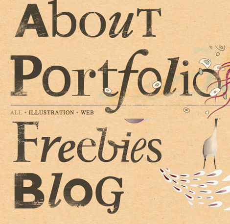
After 3 years of using the Pheonix theme on N.Design Studio, I finally redesigned it with a Koi theme. The new look has improved a lot in terms of design and WordPress implementation. Every section has a unique layout which gives you a refreshing feeling. This post will summarize everything about the new design as well as show you the process images. Also, I will talk about how other sites inspired me.
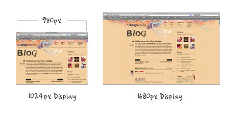
980px Page Width
The page width is 980px which is optimized for users with 1024px display, but also looks nice for users with high resolution display such as 1680px setting.
Typography
The main body font size is 16 point. I purposely set it large so viewers can read the text comfortably even sitting away from the monitor. The three main fonts that I’ve chosen are: Georgia, Helvetica, and Baskerville. Georgia is used for the main body copy. The purpose of using sans-serif font (Helvetica) is to provide contrast to the body type. Baskerville is an elegant font, so I set it for italic text and image captions.

Multiple Background Images
Each section features a different background image that blends nicely with the header image.

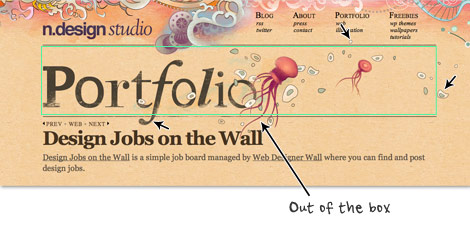
Design Out of The Box
Inspired by an article that I wrote, CSS: Design Out of the Box, I made the background images extend out to create the out-of-the-box effect. Notice the list items are also out of the box.
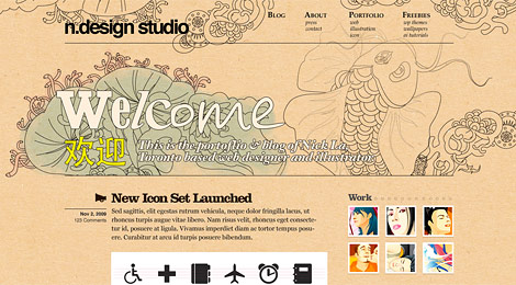
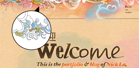
Homepage Splash
The short line of introduction briefy tells everything about the site and leads to the most important pages: portfolio, blog, about, web and illustration. The Chinese characters "欢迎" mean welcome.

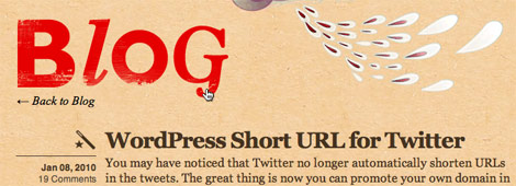
Post Type Icons
Each post has an icon next to it. They help readers quickly identify the category of the post. The icons are from the Rocky Vector Set.
![]()
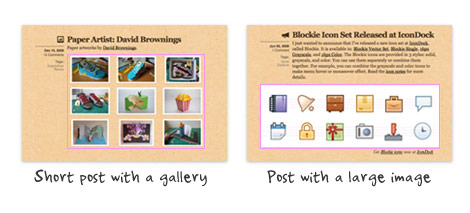
Flexible Post Format
The blog’s content area is designed to fit most type of content: whether it is a long or short post, with large or small images, or with videos and galleries.
Menu
The menu navigation is origanized in column/lists which provides easy access. When you hover over the links, it will show a tiny icon.

Page Titles
I made the page title super large so readers can quickly locate where they are. To make it look even more interesting, I randomly selected different fonts for each character.
Breadcrumbs
The title’s link also serves as breadcrumb navigation.

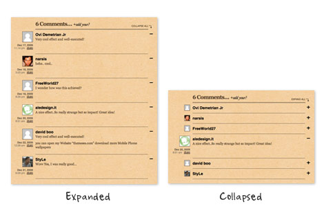
Animated Comment List
The animated collapsible/expandable comment list is done with jQuery.
Portfolio
In the portfolio, I dropped the sidebar to gain maximum area for displaying large images. I didn’t set specific dimension for the image area so they can fit various sizes.
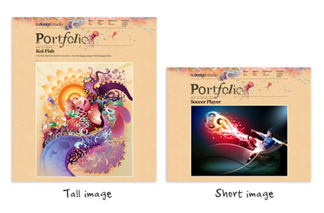
Image Loader
Unlike the usual image slideshow where images are loaded and hidden by CSS, and then swapped by Javascript. In the method I used, the large images will only load when you click on the circle buttons. This can save bandwidth and loading time because only the requested images are loaded. The tiny animated bar (right above the circle button) indicates the image that is loading.

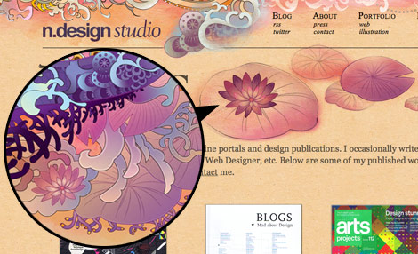
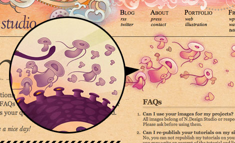
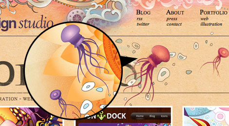
The Art of Recycling
In case you didn’t noticed, the main theme is based on the Koi fish illustration that I recently did and the rest are recycled from various illustrations.

The background illustration on the blog page is taken from the Abstract Phoenix.
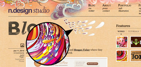
The lily pads, flying mushrooms, and jellyfishes are taken from the Koi illustration.
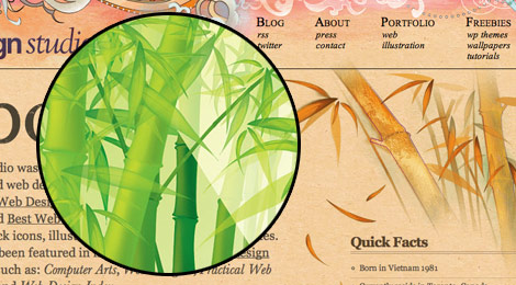
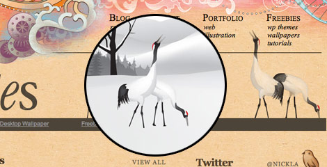
The bamboo, Japanese cranes, and cherry blossoms are taken from the old Flash version of N.Design.

Process Images
The main wireframes are done on papers.
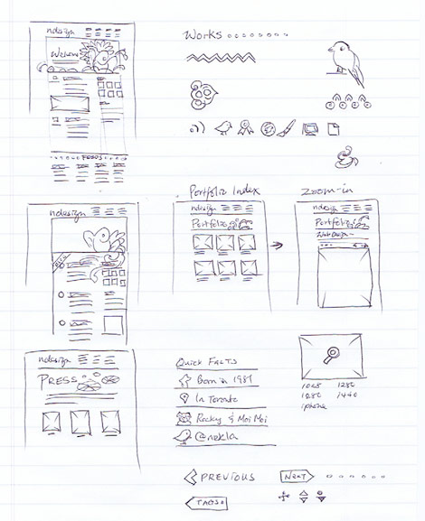
During the initial design process, I used outline vector to do test mockups.
Then, I played around with the color.

After I got the sizing and position right, I imported the color vector and brushed them up to match with the overall design.
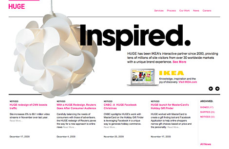
Inspiration
Huge
Very obvious, my homepage’s splash is highly inspired by the Huge’s homepage where the graphic elements extend out of the box. Read related article: CSS: Design Out of the Box
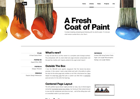
Trent Walton
Another great example of out-of-the-box design.
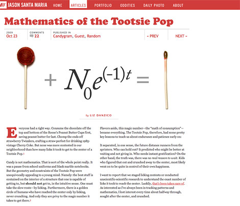
Jason Santa Maria
Jason’s web site is simply creative and amazing! Go to the site, and check out the posts. Note every post has a different layout and theme — very refreshing!
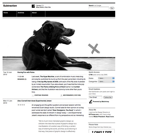
Subtraction
Although my site is not on a grid, but Khoi Vinh’s web site inspired me to use horizontal rules to divide content.
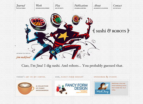
Sushi and Robots
Sushi and Robots is a beautiful site by Jina Bolton. Her site motivated me to use non-web-safe font, Baskerville italic. It is such an elegant font and I believe most of my designer visitors would have the font. Read related article: The Next Serif Trend.
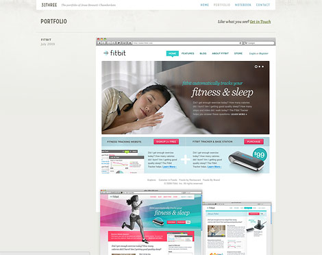
31Three
My portfolio layout was inspired by Jesse’s portfolio where he uses large image to showcase his works in full page screenshot. No description or marketing text, the images speak for his work.
Your Thoughts?
I’m very happy with the final result. It totally worth the time I spent on it — from wireframe planning to PSD designing to WordPress setup. Please let me know your thoughts on the redesign. Perhaps tell me the things that you don’t like about it.
[poll=18]
Murlu
Love the redesign, it looks absolutely fantastic and well thought out.
All of the extra work you’ve put into the subtle items really make the design stand out plus I’m a fan of jellyfish :)
I love the screenshots of the pre-coloring, shows you how much goes into it and the thought process of having to choose from so many colors.
john hanson
I am grad you spending the effort to write this topic. Great line up. We will be linking to this on our site. Keep up the excellent writing.
peterson lee
I appreciate you spending the effort to create this subject. Great line up. We will be linking to this on our site. Keep up the great writing.
Jeremy Swinnen
Very inspiring work! Thumbs up!
gummisig
Great article, as to be expected from you Nick.
I really like how you describe all the details that went into the design. And the fact that you recycle, hehe. I do that too!
Antonio
Beautiful work Nick, as usual.
I really like this new design, one of the best site I have ever seen.
cheers!
website designers stoke
The detail gone into that is very appreciated. I always love to see the methods different designers take when designing a website. Brilliant!
grandchamp_g
As usual, excellent work!
Lauren
The new design is really gorgeous, warm and inviting. It was one of the few designs to jump out at me while I scanned my RSS feeds.
Although the new design is more earthy compared to the previous one, it still retains its branding strength – something I find many site redesigns lose.
Great work! And thanks for providing us with a case study; it’s always nice see the progression from thought to end product.
^__^
Mike
The redesign looks fantastic! Thank you for the “design process” article. They are probably my favorite things to read, I love seeing how different artists plan out their projects. I posted one of my own at my site if anyone cares to take a look.
kevinczap
this is an essential article for budding web designers like myself.
Thanks so much for posting it!
Jaz
Thanks so much for sharing your process! I always enjoy reading about how designers got to their end results! Excellent redesign too, very beautiful!
Texturezine
great very nice work Nick.
dreamz
Hello,
Thanks for this it’s very interesting to know the working process.
Very good idea to have recycled old stuff.
have a good day
Bleyder
Great article. I have enjoyed to much reading it!
Chad Engle
Nick,
Your re-design is amazing. Thank you for taking the time to break down the re-design. I really appreciate when people take the time to talk about their choices and things behind it.
Cheers,
Martin
Thank you for describing the whole process of your redesign, especially which designs you drew inspiration from. Fab job!
Jerich
https://webdesignerwall.mystagingwebsite.com/wp-content/uploads/2010/01/splash.jpg
looks like a pen*s in there, is it a fish?
sarah le
wow! this design process write-up is amazing and completely helpful to me as a designer.
btw did you do the illustration artworks yourself also? if one is not an illustrator, what would you suggest is the go-to place to find beautiful illustrations like these?
thanks again for sharing! please post more articles on your process. i love it!
Martin
Great design. Did you give any special thought into the fold and how your “super large” page titles affects the over all impression of your site?
DesignLovr
Amazing redesign!
It’s great to see how you approached this project and how much planning and details it required.
lanxiaoxi
I really appreciate your process of Redesign
jeff c
Its awesome creativity .
Thanks for this it’s very interesting to know the working process.
Very good idea to have recycled old stuff.
have a good day
Virginia
I love the Japanese-style sea-life illustrations!
Design Informer
It was nice to see your redesign, and know it’s even better because I know the inspirations. thoughts, and the process that resulted in that beautiful design. Thanks for sharing Nick!
Carlos
Excellent re-design very inspirational thanks for taking us through your process. I really like how you integrated your illustration work with the page design. I had seen your website before and to see how you looked at other designs and integrated it into your new design was very useful. I recently re-designed my website but i’m not so happy with the final outcome, your work definetly inspires me too re-design again…
mokin
Nice+
Joseph Alessio
It’s a great redesign, I like the new theme much better than the old one. The old one was an amazing Photoshop piece but didn’t look so nice on a website.
I’m currently designing a portfolio site for myself, so articles like this are great for me! I am pretty new to web design, so I’m afraid my site won’t be nearly as impressive as yours is, but I have great plans and they’re slowly coming into being! haha
Thanks for the great article!
Sohna Munda
Awesome Great Work…!
Dan King
Wow, thanks for sharing your whole process! It’s always interesting to see how others work and where inspiration comes from. Really love the design!
Josh
great to see your thought process on this! thanks!
om ipit
brrr… thank for sharing…
Dharmesh Nakum
Same like others I Like that too much, because always its interesting that how others work. amazing illustration work and general layout setting of site
Il ike it
Gonzo the Great
Hi Nick,
Love the way you’ve written down the process how to design this gorgeous website!
Normally my personal taste is more white, clean and not to much illustrations (which BTW are professionally done, my compliments), but that’s just my opinion and nothing to do with the great way how you, in depth, have covered the design process and decisions why you’ve done so.
Great article, great read and thanks for sharing. Cheers & Ciao …
Shigeki
Amazing work…
Walter Apai
The redesign is awesome, you keep improving and getting better and better in your designs, with even more attention to those fine details.
I’m personally not a big fan of this type of navigation though, I find it uninspiring and even confusing and hard to grasp, I believe the focus should be on no more than 5 or 7 items and there may be too many options to look at.
Last, I’d put the illustration of the footer at the very end and relocate the search to a more prominent position near the top.
The illustration is awesome and that’s where you keep excelling ;)
jaekook
So cool! Thanks for sharing your design process.
mg12
I love your new theme, it is so pretty as a traditional Chinese painting.
我很喜欢你的新主题, 它像中国画般地优美.
rupal
Brilliant work……awesome…
can you please put a post on the step by step process of converting the koi pencil sketch to rendering it in illustration…
or if you can guide me how to convert my pencil sketches to vector in illustrator
Choupsi
Really awesome
Birgit
thanks for that detailed description, it is really interesting to read! love how your vector illustrations blend so naturally with the site…
thinkmad
I have seen the redesigned N.Design.It’s very beautiful and impressed me deeply.This article will be appreciated by all designers ,especially the beginners.
aledesign.it
Fantastic post…in a pict there a comment by me like examples! In any case this is a great site!!!! All graphic add this site.
James
Great post! Really nice to see how such a carefully constructed design is inspired, processed and brought to life!
Alfons
Awesome work! Also a nice detailed description of the design process..very inspiring
Ale
A beautiful work, an awesome site and a great article!
Julieta
Wonderfull! Thanks for posting!!
Dana ferret
absolutely amazing design. when i first saw that you redesigned your site I was really exited and went through all of the pages, especially admiring the header and footer illustrations. this design is one of my top favorites on the web.
thank you!
Jordan Walker
Great looking website that all designers and developers can look to as a beacon of excellence.
Lucas Cobb
Thank you for taking me through your thought process on the re-design. Great things to think about while designing in the future.
Chris
Wow, you did a great job so far, I love this one though the Phoenix one was awesome, also. And yeah, the illustrations are just stunning!
Euge
Its really exciting how detailed you went into explaining and describing the various design process. This has got me inspired to be more structured in my own design process and implementation of my web projects. Thanks a lot!
Irina McGuire
This is truly an example of a great designer going through his step-by-step creative process and how much is really involved. I love how you are not afraid to share your sources of inspiration. For me, you are a true inspiration!
Adana Web Tasarim
Wow, you did a great job so far, I love this one though the Phoenix one was awesome, also. And yeah, the illustrations are just stunning!
Adam Akers
Just great, that’s all that can be said. Just makes the process of a re-design look so simple. Cheers again
Adrian
I love how you included your inspirations with this post.
Designed like a true professional with no stone left un-turned. Well done Nick!
Si
This looks absolutely fantastic. Loving the header images which change with each page, looking forward to when it goes live.
Vivian
yes.. it is absolutely nice… i want to have my blog like that… :( unique design for every section…now… it just look looks so plain…
Matthew Aebersold
Great redesign, and I am inspired by the depth and detail of the process work that is shown. I am a dedicated follower of the Wall, and I will continue to be indefinitely. Thank you for this post, it was a great read.
web tasarımı
good site
Wow, you did a great job so far, I love this one though the Phoenix one was awesome, also. And yeah, the illustrations are just stunning!
Dumm
very good theme. i will try it too. look very nice
duncan
always nice to see a design process. thank you.
Pusparaj
Nice feeling seeing the process; eager to see the finale.
Korbi
you’re awesome, Nick
Nicole
You have a strong design concept on everything that you have created! Excellent Job!
Works are unique! Keep it up!
You have my 5 stars!
Amy Stoddard
Brilliant work, Chris. There’s so much depth in that overlapping linework. I really like how you share your process. I’m not much of an illustrator, but I’m learning to be less afraid of paper.
jayhan
GREAT redesign! May I know how you did the image loader thing? I’m very interested to find out! Is there any tutorial/resource for that?
Abbie
Love your designs since I stumbled upon your site 5 years ago. Have been your fan since then. Thanks for sharing your techniques. Have learned a lot from them. More success for you in the future. =)
Jack
Absolutely stunnning! Great work! Thanks for sharing the experiences.
Nikki Selene Lamagna
Hi – thanks for sharing your process. It’s always so helpful to see how other designers go through the steps to redesigning their site. I always find it much more difficult designing for myself than clients.
Your work is truly an inspiration!
louisville website designer
Love your designs! It’s really artistic and original. Not to mention your site is looks amazing. Thanks for the share! Staying tuned for more! =)
flavio
really love the new design, i knew your work and loved it before, so graphically it is on the top.
as of navigation, i think the screen it’s a bit clogged, the navigation elements don’t jump on the eye, i think the overall lacks a bit of contrast.
and i also think that little details like the img loader on the top of an already small slide-status is indifferent to the final result, i think that if you want to communicate something you should do that clearly, so the classic “rotating-something” in the middle of the img would have been better.
Alice
Truly amazing! It’s great to see step-by-step redesigning and how much work and inspiration it takes to get to such a result. Some people aren’t aware of that. Keep up the great work!
Green Hosting Services
Excellent design and excellent tips!
Michelle Buckley
Love the redesign and the fact that you have your process here as well.
Rod Homor
Great article. Thanks for sharing your process and inspiration!
grant tailor
nice design
.
.
.
http://www.contestdesigns.com
design contests for cash!!!
Rob
I stumbled across your web site while looking for articles about web design. It is simply my favourite website design. I love the thought process and really appreciate it as the audience.
Stunning, seriously, love it.
Rent Car Ankara
Thanks, excellent design..
kok aan huis
nice tutorial
Daniel
Hello. i search any body for design. i will a own design for my forum with a banner with the name jongict. but i dont know how i can make this. can any body help me?
Mohammed Alaa
Woww That’s Amazing, Thanks a lot for sharing it :)
J.
I love the re-design. It was also very interesting to see your process!
Pynouch
Brillant and very instructive proccess.
MeAgain
Smashing work! Thanks for sharing the process, I read it. :)
Simon Carr
Whoa… After seeing all the sketches and hand-drawn details that went into the redesign, I’m very impressed with the end result.
I have also created some hand-drawn designs for client websites in the past, so I understand how difficult it can be to pull off effectively. Nicely done!
http://www.workbysimon.com
-Simon Carr
Web Design Philippines
the design process is great. the details and specifications are perfect. love it. great inspiration.
Dave
Truely Inspiring stuff… feels good to browse your site
Nachio
Thanks, is amazing work, this people work hard !
Bryan McAnulty
I like the flexibility of the blog and there’s a lot of nice functionality with subtle additions like the loading indicators.
Recycling art is important for both keeping your brand consistent and providing time to finish the rest of the design.
Joe
This is quite beautiful. Love the details. Thanks for sharing!
grant tailor
i love the dull colours
it creates a nice mood
.
.
.
http://www.contestdesigns.com
design contests for cash pizes!!!
kalispious
will you write about you turned it on in wp?
Site-O-Rific
Man, that was planned to a T and quite thorough. I usually just improvise my designs.
Phil
Nice site! Is it based on the exposure theme? I just starting redesigning my portfolio and it looks very much like your site. With portfolio, about me and a blog. I will show you when I´m done.
kevin
Absolutely amazing redesign!
Luca DB
Very, very, very nice.
holeycoww
It’s a beautiful redesign, been following the blog for many years and it’s awesome to see the change! Really like it, top work Nick.
Adam Hermsdorfer
Gave it 5 stars…loved the rationale behind the creative.
Thailand apartments
Absolutely amazing redesign!
Very, very, very nice.
jhblog
Very impressive and enjoyable.
bobbi
This is so beautiful. So inspiring. I love the colors, graphics all of it. If only I were so talented. Your work always makes me smile and wish for more.
Thank you for making the web a more colorful and enjoyable place, for taking the boring out of blogs.
Yanardag
I’m very inspired.
Very nice website. :-)
Gopinath
Thoughts Hosting:- Domain Name Rs.92/-only, 10Gb space, 100 Email id’s, Rs.2600/-only. And for every domain get FREE extras over 7900/-. *Start Your Own Web Hosting Company Only for Rs.4000/-. visit: http://www.thoughtshosting.com, Contact:9059747833
Charane
love this site!!! your art & style, so inspirational! thank you for all the details, it really blows design wide open…my favorite is the out-of-the-box concept with the illustrative graphics. love it :)
Don Skiest
Thanks for the very informative sharing of your creative process. I especially like the “out-of-the-box” idea. That gives me some insight as well.
I really hate the guy who keeps spamming about the web hosting.
Tiger
I liked more the old design, i like this one but the other was better in my opinion.
Saul Hardman
Wonderful insight into your design process, this walk-through alone has taught me a lot, I’m glad you shared it!
San Francisco web design
both designs (new and old) are just great… become a fan of your art dude
Serg
Cool work, man!
Good unique ideas, and everybody sees that ideas are yours…
Go on!!:)
capsiplex
I liked more the old design, i like this one but the other was better in my opinion.
fakher
This is very useful process
Sam Ng
Sick!
I especially like the Page Title type treatment
Guy-Philippe Uberos
Which plugins do you use for your WordPress ? (Portofolio …)
Kevin
Nice! Thank you for documenting the creative process. Especially your inspiration. Your pushing the envelope and that is good.
didid
This is great Nick!!
awesome design. Full of art.
fashions
Desi Girls | Indian Girls Beautiful Pakistani Girl
and get Indian and Pakistani College Girls Friendship and Mobile Number and much more…
Girls, Indian Girls, Pakistani Girls, College Girls, Hot Girls, Good Girls
webdesignas
todo muy bien, muchas gracias. el buen diseño requiere de mucha pasiencia,
devonartist
Dear Nick
totally inspired by your work…i am building my site with Freeway…quite a clever program. Do you know it?
Web Design
i love this process thank you for sharing
Website Design
Nice design. Especially like the unique large font used in the page tiles… definitely stands out from the crowd!
Gudo Fredo
wicked sick .. nice koi…
kai
that’s great
filesforflash
nice idea to share it with us
Samuel Guedes
Hi! I´m your new fan from Brasil! Your work is fantastic! Congratulations!!! I´m new in WordPress and your website inspiring me to create my firts WP site concept in “out of the box”.
Vikesh Patel
Really nice redesign i like the attention to detail to all the separate pages. The different images for different headers and backgrounds keep the users interested in the site, as every page looks different.
Also the water coloured images and soft colours complement each other really well.
David
Hi just wanted to say great site also i was wondering how you got the chalk effect on your design?
Melvins
I really like the new refreshing design of the website right from the font type to the images. The process of images shown here is really outstanding. I find background images very creative.
Los Angeles Web Design
Premier pixels
Thanks for sharing and guiding through this tutorial.like it
Las Vegas Web Design Company
willsons
thanks a lot. your website is very good! i likeuggs outlet
Juno Mindoes
It’s sorry to hear that Some white iPhone 4 buyers have reported signal reduction when the phone is held in certain ways, especially in the left hand, as the antenna problem is in the bottom left corner of the phone’s side casing. Is that mean i have to wait longer to get the white iphone 4?
lucy
I was curious why you are providing banners in free then you said you love to design banners white iPhone 4 , so i must appreciate your work. your design is nice, so when you are uploading new design so that i can paste it to my own blog
Sterling Silver Bracelet
Thanks for sharing your experience with us…
please keep posting your reviews….
good blog really and good sharing
Henry Peise
If you want to follow the fashion trend, you can never miss the hottest White iphone 4 Conversion Kit. With smooth and liquidity design, we sure White iphone 4 Conversion Kit is what you want.
cygnis media
Very interesting post. I really enjoyed reading it.
facebook app developer
Uçak Bileti
renk uyumları çok şık
altın çilek
Thank you!! Very helpful, great technique and great explanation. And looks beautiful!!
hcg damla
Thanks for sharing your experience with us…
please keep posting your reviews….
good blog really and good sharing
stylish moncler jackets
Moncler Vests ,the classic model of Cheap Moncler Coats.Quilted Down Filled Zip Jacket with contrast zippers, buttons and cuffs. Slash button pockets at waist. Moncler Jackets Ribbed sleeve cuffs and waistband. Moncler Sweater Tone on tone stitching throughout the shell. Zip pouch with signature logo felt patch at left sleeve. The shell is made out of 100% polyamid. Moncler Shoes for Women The fill consists of 100% Goose Down.
Cheap Moncler Coats, a stylish and luxury French brand is the renowned high-end outerwear brand which created a quilted jacket trend in the fashion world. Since originating in 1952, Moncler never stops to show its high quality in the purest way. For Moncler Jackets, it requires 220 grams feathers each jacket. And for womens jackets, it requires 160 grams per one. Moncler is making the feathers one of the principle components of the garments. Besides for feathers, the material of the surface is also an important part which shows Moncler’s profession and striving to consider more for customers. Waterproof nylon surface makes consumers avoid of being wet when going out or playing in the snowing days. Gradually, Moncler develops the manufacturing of Moncler Coats, Moncler Vests, Moncler Sweater, Moncler Bags , Moncler Shoes for Women, Moncler Boots. All of the new products continue its purest design and also add some fashion elements, which makes Moncler more fashionable on basis of comfort. If it has a Moncler tag, it will keep you warm on top of the highest mountain and be trendy on any city street.
Momydffy
gothic script tattoo,
orhanbt
Verry Good
球犯
这主题真好看
complex41
And then he handed you the thirty-five 45
Web Design
Thank you for the informative post!